Welcome to another edition of Feature Friday.
Today, I’m going to go over one of the constants in life and video games – the passage of time.
What Makes You Tick?
First up, I want to talk a bit about my overall design goals for the passage of time in my game.
Village Monsters is a mashup of genres, but above all it’s focused on one thing: being a village life simulator.
To properly simulate an interesting village life you really need a lot of systems that play off each other, and there is perhaps no more important system than that of time. It’s certainly the one that I’ve given the most thought to!
Early on, I knew what I didn’t want to do…
- I didn’t want an Animal Crossing system of everything being in real time
- It’s a neat idea, but didn’t fit my vision
- I didn’t want the player to stress about what time it was
- I see this frequently with the Harvest Moon “subgenre” where you always need one eye on the clock. This also didn’t fit
- I didn’t want to stray too far from realism, either
- There’s going to be some strange things going on in this digital world – I want to give player plenty of opportunities to latch onto things that obey predictable rules
My first decision was to abstract the concept of time itself. Behind the scenes I still keep exact measurements, but to the player there are only eight slices of time for each day: Early Morning, Late Morning, Early & Late Afternoon, Early & Late Evening, and Early & Late Night

As the day marches on it’ll gradually transition from one time of day to another. There’s only eight of them (compared to, you know, 24 actual hours!), but that’ll let me give each one enough attention to make them feel distinct in their usage of music, color, lighting, and various happenings. In this way I can communicate the passage of a day without the player needing to think about the exact hour or minute.
Tick-Tock
The next challenge had to do with the length of day itself
It’s hard to make firm decisions this early on; after all, I have a single room with a couple interiors and not much to do – how on earth can I decide on a length based on that? Still, I needed something.
I ended up researching other games, such as Stardew Valley, Majora’s Mask, and Minecraft, for inspiration
It seems an average virtual day can range from as short as 10 minutes to as long as 20. Ever the compromiser, I settled on something right down the middle
The current rate of movement allows for about 2.5 minutes per time of day, for a total of about 20 minutes for a full cycle. However, practically speaking an average day will be more around 15 minutes – you won’t find much success in working sunrise to sunrise.
This rate isn’t necessarily locked in stone, either, as there will be various ways to alter the flow of time in-game. I’m open to adjusting it as we go along.
The Clock Wheel
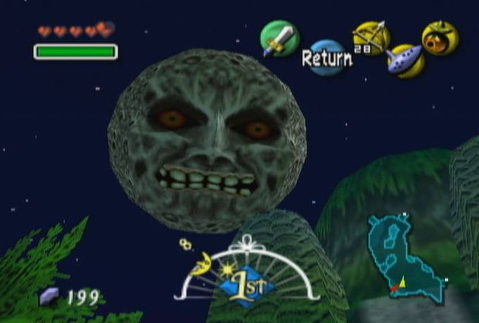
I wanted the UI element to be an important part of the time system itself. I have especially fond memories of Major’as Mask and how it communicates time to you with a big, simple visual at the bottom of your screen

I also wanted a visual like this, especially because of the game’s top-down perspective – you can’t see the sky, so communicating the passage of time (as well as the feel of each time of day) would fall heavily on the UI
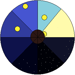
I went through a lot of iterations of a circle-based “visual clock wheel” of sorts. Eventually, I settled for the below. This is it running at “real time”…

…and here it is rapidly cycling through an entire day.

Each slice corresponds to a specific time of day as well as the weather. You” have noticed that it doesn’t just display the current time and weather, but also upcoming weather as well. This is yet another strategy of communicating the flow and passage of a day without being too obtrusive.
In the future, it’ll even tell you of upcoming holidays, events, and other things that are time-dependent – all of this, rolled up into a fairly unobtrusive UI element. I’m really happy with how it came out!
There’s also the method I am using to create the time wheel itself. Instead of creating one static image of a wheel I’m instead drawing each “slice” separately and stitching them together as the game runs. This makes it trivial to add new graphics for each time of day, weather, or holiday, and should help me stay as “futureproof” as possible.

Mega Months
I’m not quite ready to talk in great detail about other forms of time – like weeks, months, or seasons. But I did want to give a sneak peak of what I’m thinking of.
Similar to abstracting of time of day I want to also abstract the passage of months. Many games already do this, actually – in fact, the majority use a simple “1 month = 1 season” system and have four such months per year.
I didn’t like how “quick” a year felt with this system. In Village Monsters, you’re going to have a lot to do on a given day, and there’s going to be a great amount of holidays and events. I didn’t want it feeling like a month – and, by extension, an entire season – was flying by.
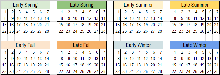
The current system I’m experiment with is a “2 months = 1 season”. Similar to my “Early Morning / Late Morning” system, I’m going with Early Season / Late Season
The “feel” of the start of a season is very different than the end of a season, and this type of system really lets me capture those differences. It also lets you ‘breath’ in between various holidays, events, and other things that’ll take up your time.
There’s always the risk of taking too much time, though, especially as it relates to how much time I can realistically ask people to play to experience everything the game has to offer. It’s a balancing act!

More to come soon. Thanks for reading!
Leave a Reply
You must be logged in to post a comment.