It takes some real skill and precision to quit a good job making lots of money to pursue a career in which you’ll make very little. It requires strategy. Foresight. A willful ignorance of consequence. I’m here to talk about my own process so that you, too, can self-destruct your finances
Today, I want to talk about my burn chart, which you’ve may have seen after reading one of my WARP DOGS CORP LOGS posts.
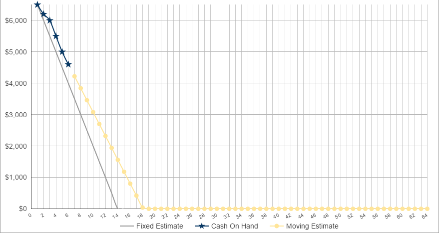
There may be other, more accurate names for this style of chart, so let me show you what I mean:

So, what exactly is this thing?
In short, the burn chart is the primary method to measure when exactly I’ll be out of money and broke as all hell.
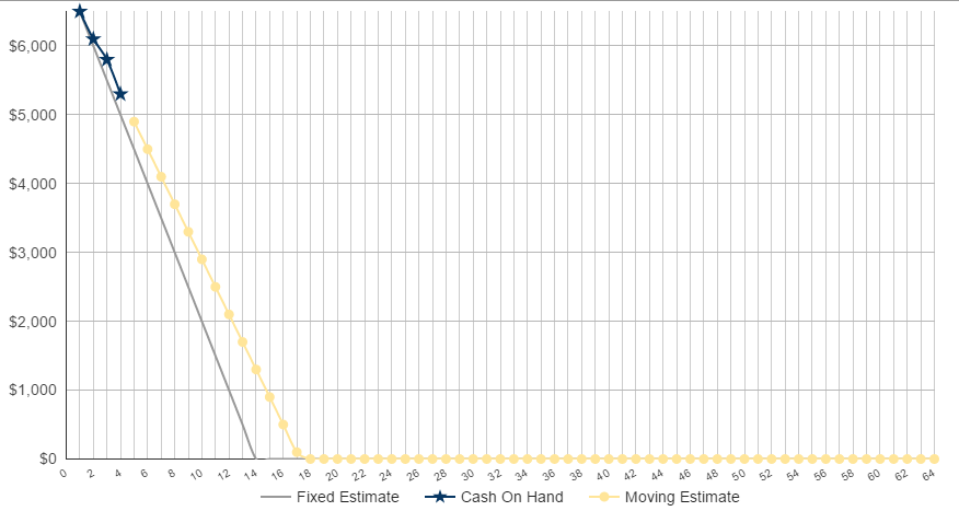
It performs this tremendous service by looking at my current cash reserves each week and compares that to both a fixed and moving estimate of where I predict my cash reserves should be each week.
It then plots this all on a nifty graph so I can visualize how fast I’m spending and when exactly I can expect to run out.
Make sense? Well, let’s dig in some more…
FIXED ESTIMATE
This is the grey line.
The fixed estimate is simple. I took a look at our average monthly expenses and compared it to our average monthly income after I quit my job. I then simply looked at the difference between the expenses and income, and called this difference the expense delta.
Said a different way, the expense delta is what’s needed to break even each month – for example, if average expenses were $5,000, and average income was $3,000, then the expense delta would be $2,000.
The Fixed Estimate is simply this delta subtracted from my cash reserves on a weekly basis. It’s a steady, consistent march to $0, and it’s also the line I want to continuously “beat” each week if I want to elongate this project.
CASH ON HAND
This is the blue line with stars.
At the start of each week I’ll record how much cash on hand I have left. The difference week to week will be reflected by the steepness of the line.
They key here is to beat the estimate. It’s sort of like racing where you want to beat your best lap times – only it’s exactly the opposite because you want to go slower, not faster.
But what happens if I do go slower? Or faster? I mean, it’s extremely unlikely I’ll spend exactly $500 a week over the course of many months, and the move I deviate from the average the less useful the fixed expense line will be.
To solve this problem, I added the moving estimate line.
MOVING ESTIMATE
This is the yellow line with the circles
Like the fixed estimate, the moving estimate steadily marches to 0 by subtracting an expense delta each week.
Unlike the fixed estimate, the speed it marches is not forever constant, but rather is based on a moving average of my actual expenses each week
Let’s use an example.
Week 1: $400 spent
Week 2: $300 spent
Week 3: $500 spent
Over these 3 weeks the moving estimate would come out to $400, and it’d look like so:

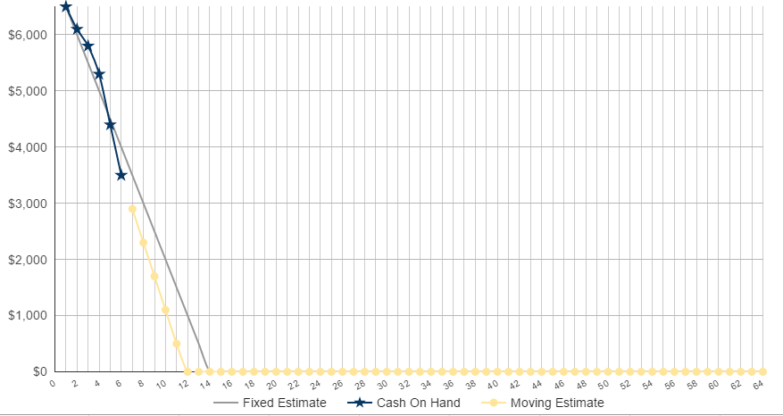
Now, let’s say week 4 and 5 look like this:
Week 4: $900 spent
Week 5: $900 spent
Now, obviously I know that spending more per week means I’ll run out of money faster, and vice versa, but it’s one thing to know something and quite another to visualize it

You can see how it shaves off 2 weeks from the fixed estimate – that’s a lot of to give up!
In conclusion, this graph does two things main things:
- It gamifies the otherwise dull task of tracking weekly expenses, encouraging me to stay under spending goals and beat my previous expectations, plus,
- It allows me to apply principals of Agile to my financial situation, adjusting my strategies and focus on a weekly basis
So, hopefully this has all made sense. If you’re looking to quit your job to pursue some passion then I strongly encourage you to make something similar – never discount the power of visualizing the speed in which your money is running out
Leave a Reply
You must be logged in to post a comment.